
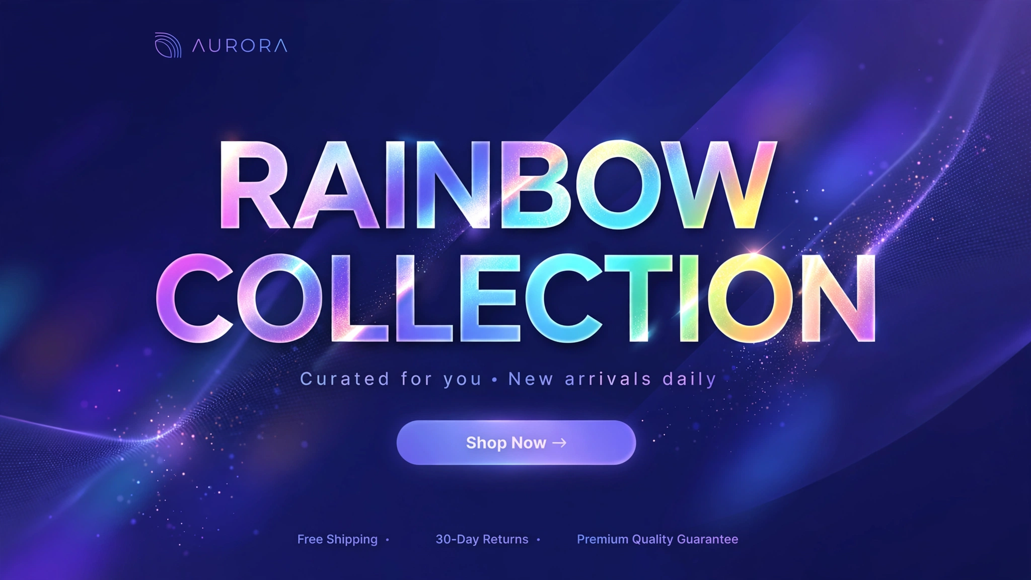
Gradient text is everywhere in 2026 — from SaaS landing pages to sneaker drops — because it makes any headline look instantly modern. The best part? It’s pure CSS: no images, no apps, no page-speed penalty. The gradient literally flows across your text in an endless loop.
Here are 6 animated gradient styles for different store vibes, each rendering live below. Copy your favourite into a Custom Liquid section and watch your headlines come alive. The technique uses background-clip: text — supported by every modern browser.
1. Fashion – Sunset Gradient Flow
Warm sunset tones flowing endlessly across your sale headline — this is the gradient that launched a thousand Instagram ads. The orange-to-pink sweep feels energetic and youthful, perfect for fashion drops and seasonal sales. The 3-second loop is fast enough to notice, slow enough to stay classy.
Preview
SALE UP TO 50% OFF
Live gradient flow above ☝️ — sunset vibes.
Liquid Code
<div class="lk-gt1">
  <h2 class="lk-gt1-title">SALE UP TO 50% OFF</h2>
</div>
<style>
.lk-gt1{text-align:center;padding:70px 20px;background:#14141f;border-radius:12px}
.lk-gt1-title{font-size:54px;margin:0;font-weight:800;background:linear-gradient(90deg,#ff4d6d,#ffb347,#ff4d6d);background-size:200% auto;-webkit-background-clip:text;background-clip:text;color:transparent;animation:lk-gt1Flow 3s linear infinite;}
@keyframes lk-gt1Flow{to{background-position:200% center}}
</style>
2. Beauty – Pastel Shimmer
Soft pastel gradients whisper luxury instead of shouting discounts. This dreamy pink-lavender-mint flow is made for cosmetics, skincare, and wellness brands where the aesthetic is the product. The slower 5-second animation keeps it calm and dreamy — like your headline is breathing.
Preview
Glow Starts Here
Live pastel shimmer above ☝️ — dreamy and calm.
Liquid Code
<div class="lk-gt2">
  <h2 class="lk-gt2-title">Glow Starts Here</h2>
</div>
<style>
.lk-gt2{text-align:center;padding:70px 20px;background:#fdf7fa;border-radius:12px}
.lk-gt2-title{font-size:54px;margin:0;font-weight:800;background:linear-gradient(90deg,#f9a8d4,#c4b5fd,#a5f3d0,#f9a8d4);background-size:200% auto;-webkit-background-clip:text;background-clip:text;color:transparent;animation:lk-gt2Flow 5s linear infinite;}
@keyframes lk-gt2Flow{to{background-position:200% center}}
</style>
3. Tech – Neon Cyber Gradient
Cyan-to-magenta on near-black: the unofficial uniform of tech stores. This high-contrast electric flow looks like it belongs on a GPU launch page. Add a subtle text glow and your headline practically hums. Ideal for electronics, gaming accessories, and anything with a circuit board inside.
Preview
NEXT-GEN TECH
Live neon flow above ☝️ — cyber mode on.
Liquid Code
<div class="lk-gt3">
  <h2 class="lk-gt3-title">NEXT-GEN TECH</h2>
</div>
<style>
.lk-gt3{text-align:center;padding:70px 20px;background:#050510;border-radius:12px}
.lk-gt3-title{font-size:54px;margin:0;font-weight:800;background:linear-gradient(90deg,#00ffcc,#7b2ff7,#00ffcc);background-size:200% auto;-webkit-background-clip:text;background-clip:text;color:transparent;animation:lkGt3Flow 2.5s linear infinite;filter:drop-shadow(0 0 12px rgba(0,255,204,.35))}
@keyframes lkGt3Flow{to{background-position:200% center}}
</style>
4. Kids – Rainbow Wave
Why settle for two colours when you can have all of them? This full rainbow sweep is pure joy — perfect for toy stores, kids’ fashion, and party supplies. The playful wave practically bounces off the screen. Warning: may cause spontaneous smiling. Keep the surrounding design simple so the rainbow stays the star.
Preview
Fun For Everyone!
Live rainbow wave above ☝️ — all the colours!
Liquid Code
<div class="lk-gt4">
  <h2 class="lk-gt4-title">Fun For Everyone!</h2>
</div>
<style>
.lk-gt4{text-align:center;padding:70px 20px;background:#fffdf5;border-radius:12px}
.lk-gt4-title{font-size:54px;margin:0;font-weight:800;background:linear-gradient(90deg,#ff5e5e,#ffb347,#f9f871,#7bf59b,#6ec6ff,#c58bff,#ff5e5e);background-size:200% auto;-webkit-background-clip:text;background-clip:text;color:transparent;animation:lk-gt4Flow 3s linear infinite;}
@keyframes lk-gt4Flow{to{background-position:200% center}}
</style>
5. Luxury – Gold Shine Sweep
Real luxury doesn’t flash — it gleams. This champagne-gold gradient with a slow shine sweep looks like light moving across brushed metal. The 6-second loop is deliberately unhurried: wealth whispers. Use it for jewellery, watches, premium fragrances, or any headline where the price has three digits.
Preview
Timeless Elegance
Live gold shine above ☝️ — pure luxury.
Liquid Code
<div class="lk-gt5">
  <h2 class="lk-gt5-title">Timeless Elegance</h2>
</div>
<style>
.lk-gt5{text-align:center;padding:70px 20px;background:#141210;border-radius:12px}
.lk-gt5-title{font-size:54px;margin:0;font-weight:600;font-family:Georgia,serif;background:linear-gradient(110deg,#8a6d3b 20%,#f5e6b8 40%,#8a6d3b 60%);background-size:220% auto;-webkit-background-clip:text;background-clip:text;color:transparent;animation:lkGt5Shine 6s linear infinite}
@keyframes lkGt5Shine{to{background-position:220% center}}
</style>
6. Fitness – Fire Gradient Pulse
Red-to-orange fire tones with a pulsing scale — this headline doesn’t just sit there, it burns. The subtle pulse (scaling 1→1.03) adds heartbeat energy on top of the flowing gradient. Made for pre-workout brands, HIIT programs, and flash sales where urgency is the whole point.
Preview
BURN FAT FASTER
Live fire pulse above ☝️ — feel the burn.
Liquid Code
<div class="lk-gt6">
  <h2 class="lk-gt6-title">BURN FAT FASTER</h2>
</div>
<style>
.lk-gt6{text-align:center;padding:70px 20px;background:#160b0b;border-radius:12px}
.lk-gt6-title{font-size:54px;margin:0;font-weight:900;letter-spacing:1px;background:linear-gradient(90deg,#ff3b3b,#ff8a00,#ff3b3b);background-size:200% auto;-webkit-background-clip:text;background-clip:text;color:transparent;animation:lkGt6Flow 2s linear infinite, lkGt6Pulse 1.6s ease-in-out infinite}
@keyframes lkGt6Flow{to{background-position:200% center}}
@keyframes lkGt6Pulse{0%,100%{transform:scale(1)}50%{transform:scale(1.03)}}
</style>
How to Add Animated Gradient Text to Shopify
- From your Shopify admin, go to Online Store → Themes.
- Click Customize on your live (published) theme.
- In the theme editor sidebar, click Add section → Custom Liquid.
- Copy the code from any variation above and paste it into the Custom Liquid box.
- Drag the section where you want it on the homepage and click Save — done! No app needed.
Customize the Animated Gradient Text
- Change the gradient colours — edit the hex codes inside
linear-gradient(...)to match your brand palette. - Control the speed: lower the seconds (e.g.
3s→1.5s) for a faster flow, raise it for calm luxury. - Try a different angle:
90degflows sideways,180degflows top-to-bottom. - Add more colour stops for richer rainbows — just keep the first and last colour identical for a seamless loop.
- The effect needs
background-clip:text+color:transparent— don’t remove those two lines or the magic breaks.
More Shopify Code Sections
- Shopify Hero Banner Text Animation (Liquid + CSS)
- Shopify Liquid Typing Text Effect
- Shopify Video Background Hero Section
- Shopify Animated Counter Section
- Shopify Liquid Announcement Bar with Scrolling Text
- Shopify Animated Sale Announcement Bar
- Shopify Testimonial Auto Slider
- Shopify Dual-Line Marquee Effect
Conclusion
Animated gradient text is the rare effect that’s both stunning and featherweight — zero images, zero JavaScript, just clever CSS. Drop it on sale headlines, collection titles, or your main hero, and watch a plain storefront turn into something people screenshot. Pick the palette that matches your brand’s energy, paste it into Custom Liquid, and you’re done in two minutes flat.
Want more copy-paste Shopify sections like this? Check out LayoutKart’s premium Shopify templates — professionally designed themes packed with conversion-boosting sections, ready to launch in minutes.
