
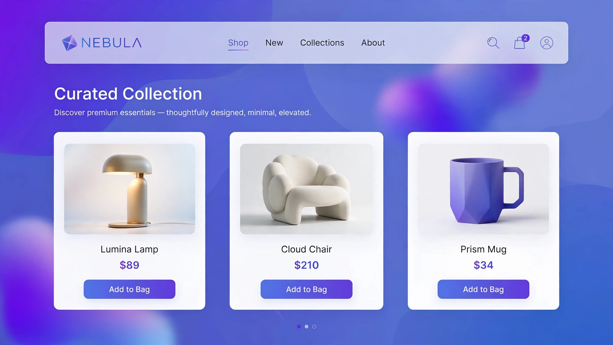
Your collection grid is your storefront window — and the default grid is the same window every other Shopify store has. With a little custom CSS you can go editorial, masonry, or feature-led without touching theme files or installing apps. Five layout recipes below, each previewed live with mini product cards and ready to paste into a Custom liquid section.
1. Fashion – 4-Column Clean Grid
Four tight columns with generous whitespace — the fast-fashion standard for a reason: more products above the fold, faster scanning. The CSS grid auto-flows, so it works with any product count. Keep card padding minimal for that dense catalog feel.
Preview
Tee 1
₹899
Tee 2
₹999
Tee 3
₹1099
Tee 4
₹1199
Try it: resize your browser to see it collapse to 2 columns on mobile
Liquid Code
<div class="lkc-gr1">
<div class="lkc-grid"><div class="lkc-mini"><div></div><p>Tee 1</p><b>₹899</b></div><div class="lkc-mini"><div></div><p>Tee 2</p><b>₹999</b></div><div class="lkc-mini"><div></div><p>Tee 3</p><b>₹1099</b></div><div class="lkc-mini"><div></div><p>Tee 4</p><b>₹1199</b></div></div>
</div>
<style>
.lkc-gr1{max-width:320px;margin:24px auto;font-family:-apple-system,'Segoe UI',Roboto,sans-serif}
.lkc-gr1 .lkc-card{background:#fff;border-radius:14px;overflow:hidden;box-shadow:0 2px 12px rgba(30,27,75,.10);transition:transform .35s ease,box-shadow .35s ease}
.lkc-gr1 .lkc-media{position:relative;aspect-ratio:4/5;overflow:hidden;background:#eef2ff}
.lkc-gr1 .lkc-ph{position:absolute;inset:0;background:linear-gradient(135deg,#c7d2fe 0%,#ddd6fe 55%,#e9d5ff 100%)}
.lkc-gr1 .lkc-ph2{position:absolute;inset:0;background:linear-gradient(135deg,#a5b4fc 0%,#c4b5fd 60%,#f0abfc 100%);opacity:0;transition:opacity .45s ease}
.lkc-gr1 .lkc-info{padding:14px 16px 18px;text-align:center}
.lkc-gr1 .lkc-info h4{margin:0 0 6px;font-size:16px;color:#1e1b4b;font-weight:600}
.lkc-gr1 .lkc-price{margin:0 0 12px;font-weight:700;color:#4f46e5;font-size:15px}
.lkc-gr1 .lkc-price s{color:#9ca3af;font-weight:400;margin-right:6px}
.lkc-gr1 .lkc-btn{display:inline-block;background:#4f46e5;color:#fff;border:0;border-radius:999px;padding:10px 24px;font-weight:600;cursor:pointer;font-size:14px;transition:background .25s,transform .25s}
.lkc-gr1 .lkc-btn:hover{background:#4338ca}
.lkc-gr1 .lkc-grid{display:grid;grid-template-columns:repeat(4,1fr);gap:14px}.lkc-gr1 .lkc-mini{background:#fff;border-radius:10px;overflow:hidden;box-shadow:0 1px 6px rgba(30,27,75,.08);text-align:center;padding-bottom:10px}.lkc-gr1 .lkc-mini div:first-child{aspect-ratio:1;background:linear-gradient(135deg,#c7d2fe,#e9d5ff)}.lkc-gr1 .lkc-mini p{margin:8px 0 2px;font-size:12px;font-weight:600;color:#1e1b4b}.lkc-gr1 .lkc-mini b{font-size:12px;color:#4f46e5}@media(max-width:600px){.lkc-gr1 .lkc-grid{grid-template-columns:repeat(2,1fr)}}
</style>
2. Electronics – 3-Column Card Grid
Three roomy columns with spec chips under each product — tech shoppers compare, so give each card breathing room for a feature line. The wider cards also fit longer product names without wrapping awkwardly. A workhorse for gadget catalogs.
Preview
Gadget 1
128GB • 5G₹11999
Gadget 2
128GB • 5G₹13999
Gadget 3
128GB • 5G₹15999
Try it: note the spec lines under each product
Liquid Code
<div class="lkc-gr2">
<div class="lkc-grid"><div class="lkc-mini"><div></div><p>Gadget 1</p><small>128GB • 5G</small><b>₹11999</b></div><div class="lkc-mini"><div></div><p>Gadget 2</p><small>128GB • 5G</small><b>₹13999</b></div><div class="lkc-mini"><div></div><p>Gadget 3</p><small>128GB • 5G</small><b>₹15999</b></div></div>
</div>
<style>
.lkc-gr2{max-width:320px;margin:24px auto;font-family:-apple-system,'Segoe UI',Roboto,sans-serif}
.lkc-gr2 .lkc-card{background:#fff;border-radius:14px;overflow:hidden;box-shadow:0 2px 12px rgba(30,27,75,.10);transition:transform .35s ease,box-shadow .35s ease}
.lkc-gr2 .lkc-media{position:relative;aspect-ratio:4/5;overflow:hidden;background:#eef2ff}
.lkc-gr2 .lkc-ph{position:absolute;inset:0;background:linear-gradient(135deg,#c7d2fe 0%,#ddd6fe 55%,#e9d5ff 100%)}
.lkc-gr2 .lkc-ph2{position:absolute;inset:0;background:linear-gradient(135deg,#a5b4fc 0%,#c4b5fd 60%,#f0abfc 100%);opacity:0;transition:opacity .45s ease}
.lkc-gr2 .lkc-info{padding:14px 16px 18px;text-align:center}
.lkc-gr2 .lkc-info h4{margin:0 0 6px;font-size:16px;color:#1e1b4b;font-weight:600}
.lkc-gr2 .lkc-price{margin:0 0 12px;font-weight:700;color:#4f46e5;font-size:15px}
.lkc-gr2 .lkc-price s{color:#9ca3af;font-weight:400;margin-right:6px}
.lkc-gr2 .lkc-btn{display:inline-block;background:#4f46e5;color:#fff;border:0;border-radius:999px;padding:10px 24px;font-weight:600;cursor:pointer;font-size:14px;transition:background .25s,transform .25s}
.lkc-gr2 .lkc-btn:hover{background:#4338ca}
.lkc-gr2 .lkc-grid{display:grid;grid-template-columns:repeat(3,1fr);gap:18px}.lkc-gr2 .lkc-mini{background:#fff;border-radius:12px;overflow:hidden;box-shadow:0 2px 10px rgba(30,27,75,.10);text-align:center;padding-bottom:12px}.lkc-gr2 .lkc-mini div:first-child{aspect-ratio:16/10;background:linear-gradient(135deg,#bae6fd,#ddd6fe)}.lkc-gr2 .lkc-mini p{margin:10px 0 2px;font-size:13px;font-weight:600;color:#1e1b4b}.lkc-gr2 .lkc-mini small{display:block;color:#64748b;font-size:11px;margin-bottom:4px}.lkc-gr2 .lkc-mini b{font-size:13px;color:#0284c7}@media(max-width:600px){.lkc-gr2 .lkc-grid{grid-template-columns:repeat(2,1fr)}}
</style>
3. Jewelry – 2-Column Editorial Grid
Two large columns with editorial spacing — luxury needs air. Each piece gets a gallery-like frame, and the generous gaps make the collection feel curated rather than stocked. Fewer products per row paradoxically raises perceived value.
Preview
Heirloom 1
₹30000
Heirloom 2
₹35000
Try it: feel the gallery-like spacing
Liquid Code
<div class="lkc-gr3">
<div class="lkc-grid"><div class="lkc-mini"><div></div><p>Heirloom 1</p><b>₹30000</b></div><div class="lkc-mini"><div></div><p>Heirloom 2</p><b>₹35000</b></div></div>
</div>
<style>
.lkc-gr3{max-width:320px;margin:24px auto;font-family:-apple-system,'Segoe UI',Roboto,sans-serif}
.lkc-gr3 .lkc-card{background:#fff;border-radius:14px;overflow:hidden;box-shadow:0 2px 12px rgba(30,27,75,.10);transition:transform .35s ease,box-shadow .35s ease}
.lkc-gr3 .lkc-media{position:relative;aspect-ratio:4/5;overflow:hidden;background:#eef2ff}
.lkc-gr3 .lkc-ph{position:absolute;inset:0;background:linear-gradient(135deg,#c7d2fe 0%,#ddd6fe 55%,#e9d5ff 100%)}
.lkc-gr3 .lkc-ph2{position:absolute;inset:0;background:linear-gradient(135deg,#a5b4fc 0%,#c4b5fd 60%,#f0abfc 100%);opacity:0;transition:opacity .45s ease}
.lkc-gr3 .lkc-info{padding:14px 16px 18px;text-align:center}
.lkc-gr3 .lkc-info h4{margin:0 0 6px;font-size:16px;color:#1e1b4b;font-weight:600}
.lkc-gr3 .lkc-price{margin:0 0 12px;font-weight:700;color:#4f46e5;font-size:15px}
.lkc-gr3 .lkc-price s{color:#9ca3af;font-weight:400;margin-right:6px}
.lkc-gr3 .lkc-btn{display:inline-block;background:#4f46e5;color:#fff;border:0;border-radius:999px;padding:10px 24px;font-weight:600;cursor:pointer;font-size:14px;transition:background .25s,transform .25s}
.lkc-gr3 .lkc-btn:hover{background:#4338ca}
.lkc-gr3 .lkc-grid{display:grid;grid-template-columns:repeat(2,1fr);gap:28px;max-width:560px;margin:0 auto}.lkc-gr3 .lkc-mini{background:#fff;border-radius:6px;overflow:hidden;text-align:center;padding-bottom:14px}.lkc-gr3 .lkc-mini div:first-child{aspect-ratio:1;background:linear-gradient(135deg,#f5e6c4,#e8c877)}.lkc-gr3 .lkc-mini p{margin:12px 0 4px;font-family:Georgia,serif;font-style:italic;font-size:15px;color:#5b4306}.lkc-gr3 .lkc-mini b{font-size:13px;color:#8a6d1c;letter-spacing:1px}
</style>
4. Beauty – Masonry Columns
Pinterest-style masonry for varied product imagery — tall serums next to square compacts, all flowing naturally. Beauty catalogs have mixed aspect ratios, and masonry embraces that instead of fighting it. Pure CSS columns, no JavaScript.
Preview
Serum
₹1,499
Compact
₹899
Toner
₹1,099
Blush
₹7,99
Try it: notice how mixed heights flow naturally
Liquid Code
<div class="lkc-gr4">
<div class="lkc-grid"><div class="lkc-mini"><div style="aspect-ratio:3/4"></div><p>Serum</p><b>₹1,499</b></div><div class="lkc-mini"><div style="aspect-ratio:1"></div><p>Compact</p><b>₹899</b></div><div class="lkc-mini"><div style="aspect-ratio:3/4"></div><p>Toner</p><b>₹1,099</b></div><div class="lkc-mini"><div style="aspect-ratio:1"></div><p>Blush</p><b>₹7,99</b></div></div>
</div>
<style>
.lkc-gr4{max-width:320px;margin:24px auto;font-family:-apple-system,'Segoe UI',Roboto,sans-serif}
.lkc-gr4 .lkc-card{background:#fff;border-radius:14px;overflow:hidden;box-shadow:0 2px 12px rgba(30,27,75,.10);transition:transform .35s ease,box-shadow .35s ease}
.lkc-gr4 .lkc-media{position:relative;aspect-ratio:4/5;overflow:hidden;background:#eef2ff}
.lkc-gr4 .lkc-ph{position:absolute;inset:0;background:linear-gradient(135deg,#c7d2fe 0%,#ddd6fe 55%,#e9d5ff 100%)}
.lkc-gr4 .lkc-ph2{position:absolute;inset:0;background:linear-gradient(135deg,#a5b4fc 0%,#c4b5fd 60%,#f0abfc 100%);opacity:0;transition:opacity .45s ease}
.lkc-gr4 .lkc-info{padding:14px 16px 18px;text-align:center}
.lkc-gr4 .lkc-info h4{margin:0 0 6px;font-size:16px;color:#1e1b4b;font-weight:600}
.lkc-gr4 .lkc-price{margin:0 0 12px;font-weight:700;color:#4f46e5;font-size:15px}
.lkc-gr4 .lkc-price s{color:#9ca3af;font-weight:400;margin-right:6px}
.lkc-gr4 .lkc-btn{display:inline-block;background:#4f46e5;color:#fff;border:0;border-radius:999px;padding:10px 24px;font-weight:600;cursor:pointer;font-size:14px;transition:background .25s,transform .25s}
.lkc-gr4 .lkc-btn:hover{background:#4338ca}
.lkc-gr4 .lkc-grid{columns:3;column-gap:14px}.lkc-gr4 .lkc-mini{break-inside:avoid;background:#fff;border-radius:12px;overflow:hidden;box-shadow:0 2px 10px rgba(30,27,75,.10);text-align:center;padding-bottom:10px;margin-bottom:14px}.lkc-gr4 .lkc-mini div:first-child{background:linear-gradient(135deg,#fbcfe8,#e9d5ff)}.lkc-gr4 .lkc-mini p{margin:8px 0 2px;font-size:12px;font-weight:600;color:#1e1b4b}.lkc-gr4 .lkc-mini b{font-size:12px;color:#db2777}@media(max-width:600px){.lkc-gr4 .lkc-grid{columns:2}}
</style>
5. Home – Feature + Grid Mix
One large featured product followed by a compact grid — perfect for hero drops: the new sofa gets the spotlight, accessories fill the grid. Collection storytelling beats plain catalogs for home brands. The featured card spans two columns on desktop.
Preview
Cushion 1
₹1099
Cushion 2
₹1299
Cushion 3
₹1499
Cushion 4
₹1699
Try it: the featured card spans two columns
Liquid Code
<div class="lkc-gr5">
<div class="lkc-grid"><div class="lkc-feat">New: Cloud Sofa — ₹29,999</div><div class="lkc-mini"><div></div><p>Cushion 1</p><b>₹1099</b></div><div class="lkc-mini"><div></div><p>Cushion 2</p><b>₹1299</b></div><div class="lkc-mini"><div></div><p>Cushion 3</p><b>₹1499</b></div><div class="lkc-mini"><div></div><p>Cushion 4</p><b>₹1699</b></div></div>
</div>
<style>
.lkc-gr5{max-width:320px;margin:24px auto;font-family:-apple-system,'Segoe UI',Roboto,sans-serif}
.lkc-gr5 .lkc-card{background:#fff;border-radius:14px;overflow:hidden;box-shadow:0 2px 12px rgba(30,27,75,.10);transition:transform .35s ease,box-shadow .35s ease}
.lkc-gr5 .lkc-media{position:relative;aspect-ratio:4/5;overflow:hidden;background:#eef2ff}
.lkc-gr5 .lkc-ph{position:absolute;inset:0;background:linear-gradient(135deg,#c7d2fe 0%,#ddd6fe 55%,#e9d5ff 100%)}
.lkc-gr5 .lkc-ph2{position:absolute;inset:0;background:linear-gradient(135deg,#a5b4fc 0%,#c4b5fd 60%,#f0abfc 100%);opacity:0;transition:opacity .45s ease}
.lkc-gr5 .lkc-info{padding:14px 16px 18px;text-align:center}
.lkc-gr5 .lkc-info h4{margin:0 0 6px;font-size:16px;color:#1e1b4b;font-weight:600}
.lkc-gr5 .lkc-price{margin:0 0 12px;font-weight:700;color:#4f46e5;font-size:15px}
.lkc-gr5 .lkc-price s{color:#9ca3af;font-weight:400;margin-right:6px}
.lkc-gr5 .lkc-btn{display:inline-block;background:#4f46e5;color:#fff;border:0;border-radius:999px;padding:10px 24px;font-weight:600;cursor:pointer;font-size:14px;transition:background .25s,transform .25s}
.lkc-gr5 .lkc-btn:hover{background:#4338ca}
.lkc-gr5 .lkc-grid{display:grid;grid-template-columns:repeat(4,1fr);gap:14px}.lkc-gr5 .lkc-feat{grid-column:span 2;grid-row:span 2;background:linear-gradient(135deg,#a7f3d0,#6ee7b7);border-radius:12px;display:flex;align-items:flex-end;padding:18px;color:#064e3b;font-weight:800;font-size:16px}.lkc-gr5 .lkc-mini{background:#fff;border-radius:10px;overflow:hidden;box-shadow:0 1px 6px rgba(30,27,75,.08);text-align:center;padding-bottom:10px}.lkc-gr5 .lkc-mini div:first-child{aspect-ratio:1;background:linear-gradient(135deg,#fde68a,#fcd34d)}.lkc-gr5 .lkc-mini p{margin:8px 0 2px;font-size:12px;font-weight:600;color:#1e1b4b}.lkc-gr5 .lkc-mini b{font-size:12px;color:#b45309}@media(max-width:600px){.lkc-gr5 .lkc-feat{grid-column:span 2}.lkc-gr5 .lkc-grid{grid-template-columns:repeat(2,1fr)}}
</style>
How to Add Collection Grid Layout to Shopify
- In your Shopify admin, go to Online Store → Themes.
- Click Customize on your published theme.
- At the top, pick the template where you want the demo (e.g. Collection → Default collection).
- Click Add section → Custom liquid.
- Paste the code from above into the Custom liquid box and click Save. That is it — no apps, no theme-file edits.
Customize the Collection Grid Layout
- Change column counts with repeat() — 4 for dense catalogs, 2 for luxury.
- Tune the gap to your brand: 12px feels modern, 28px feels editorial.
- The media queries collapse grids on mobile — always test at 375px wide.
- Wrap these around Shopify’s real product loop ({% for product in collection.products %}) for production use.
More Shopify Code Sections
- Shopify Product Card Hover Effect (Liquid + CSS)
- Shopify Collection Page Custom Filter Design
- Shopify Product Image Changes on Hover (Second Image)
- Shopify Product Card Sale Badge with Liquid
- Shopify Infinite Logo Carousel
- Shopify Scrolling Brand Logos Section
- Shopify Image Hover Zoom Effect
- Shopify Before & After Image Slider
Conclusion
Your grid is your window display — make it yours. These five CSS layouts drop into a Custom liquid section and instantly differentiate your catalog from every default Dawn grid out there. Start with the layout that matches your catalog size, then refine the details.
Want effects like these on your whole store, done for you? LayoutKart builds conversion-focused Shopify stores with premium touches baked in — no apps needed.
